People who know me well know I have a thing for decorating. My desktop theme and Winamp skin change monthly. And you should see me go nuts in the Sims. That being said, Crimson Sky Creations went through a couple of changes before it reached where it is now, and it will probably change in the future.
I'm going to try to keep it down to once a year now.
I can't afford to color over any more gray hairs.
|
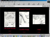
Ahh...my very first...storage space. I won't even call it a page because I certainly didn't use it as one. I only put my artwork on the World Wide Web because I wanted to be able to show off new artwork to friends without having to mail it to them, and because at the time I was entering a lot of contests, and it was easier to send them a link than it was to upload a file through the mail. The site didn't have a name other than "Crissy's Fanart". Those weren't the actual thumbnails I used--I wasn't that bad!--but the originals have been discarded long ago... |
|
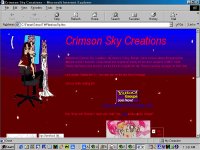
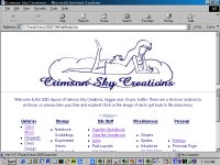
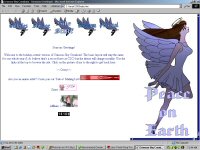
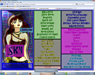
I only decided to make a real webpage when I ran out of room on the Geocities account I used for my storage space. I tried to upload it to NBCi, but it was right about then they closed down their member sites, so, ironically enough, I kept the space in the same Geocities account, which, still more ironically, is still the address I keep my counter on and my links to. It's just easier that way, people don't like having to change their links all the time. Anyway, the name was brainstormed by quite a few of my friends, but I think it was Hime-chan who hit on Crimson Sky Creations, which had everything I wanted in a name: Crimson, because my favorite color is red and I identify with Sailor Mars, Creations for obvious reasons, and Sky because I've always had this trippy kind of metaphysical star child thing going on. I drew the layout picture of me with the grownup Chibiusa because she was the character I drew the most. All of my layout pictures for this layout were me dressed in some shade of red and the pose and clothing usually had something to do with what section it was. The backgrounds were really cheesy looking ones I made myself in PhotoMAX that were supposed to be crimson skies. I made the buttons myself and I made the really cute sign/view guestbook buttons myself (I really miss those!) All in all, it wasn't fancy looking, but it was MINE. For all intents and purposes, Crimson Sky Creations was born on June 6th, 2000. |
|
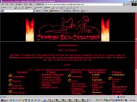
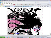
Interestingly enough, this layout change came about as part of a pic exchange. I had planned to do something new for Halloween, of course, because it is my favorite holiday, but I hadn't really decided on what, when Susan Torres offered to make me a new layout as her half of a pic exchange. Well, since my other layouts were not exactly ringing successes, I was really curious to see what she came up with. What you see here is not exactly what she sent me--hers had a guest art as the main pic and wasn't themed for Halloween. I made it a bit more "mine" by duplicating all the layout pics I had in the first layout but with a Halloween theme. But the backgrounds and the general layout of all text is hers. |
|
I didn't intend for a layout change to become a monthly thing, really I didn't! But I couldn't leave a Halloween theme up after Halloween, you take that sort of thing down when the decorations come down. I knew I'd be redoing the site for Christmas, so I wanted something simple for the brief interlude of November. This came out way better than I expected. It wasn't that much different in concept from the original layout: Layout pic on left, crimson sky backgrounds. I took graphics of different sorts of crimson skies off of Google's image search, and I used guest art (with permission, of course) that went with the different sections as the layout pics. It came out really pretty! Plus, I made all of the text a lot smaller, so this layout looked pretty good in small resolutions. |
|
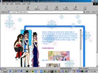
Oh...my...GOD. I went ALL OUT with this layout. Never, never again. Though, to be honest, this is *exactly* what I wanted. Some of the aspects of this design--most notably, the expandable border of the table--dated back to what I originally had in mind when I designed the first layout of Crimson Sky Creations, but I didn't know how to do. To be honest, I still don't quite know how everything on here was done. I had a LOT of help, most notably from Paul, Alex, and Simon. It's definitely recognizable as Crimson Sky Creations, though, with a few improvements. I made the backgrounds (both the clear, and the slightly obscured one) myself with some help again from Google's image search, and then I recycled with a free snow script. The layout image is the familiar from times past, but updated with slightly more CLAMP-ish eyes--and dressed for the holidays, of course. The main layout had an iframe that the sections loaded in, and the sections were not subdivided as they had previously been, and once more I made buttons for them. Also, this month saw a move for the content of CSC to Tripod, as I had outgrown 4 (count them--4!!!) accounts at Geocities, but I left a splash page on Geocities with a counter, and a choice for visitors to visit either the layout I had envisioned, or a toned down version for Netscape and slower connection users. Incidentally, the higher your resolution, the better it looked. It was magic. But I don't think I'll ever be doing that again. |
|
The layout for 2002. The idea for this layout came to me 6 o'clock in the morning one early November morning, while I was still puzzling out how to do December's layout...yes, I do need professional help. But I saw it in my head and was attracted to how simplistic and elegant it looked, and I knew it was just what I needed for the new year. I felt a little bad because there is no Crimson nor Skies in it whatsover, but that's still me (in a very Naoko Takeuchi style) at the top there, and the main sections still exist, only now they've been joined by much, much more. Just some very simple frames and tables involved here, and still the splash page at the Geocities address. This was my experiment to see how interested visitors might be in things other than my art. |
|
A slight improvement from the one that had stayed so long--this layout included Javascript that let folders open just like they do in Windows Explorer. Sadly, I had to make a second layout for users with Mac and Netscape and whathaveyou. |
|
A stroke of genius on my part, if I do say so myself. During October 2002, when you went to my site, you saw the 6th layout...for all of a minute (if that long). Then, the layout slowly dissolved to....EVVVIILLL!! Mwa-ha-ha! Seriously though, all it was was a redirect script and a dissolve effect, and then the same menu script as above. |
|
After the quick changes you can see above, I decided that for one year, the basic layout would stay the same, but that the theme (consisting of font and link colors, navigation buttons, and a layout image and matching 404 page, and a few other odds and ends) should change monthly. Oi. I missed the month of April entirely due to site and work problems, and most of my updates were late. Still, it wasn't a bad idea. Just a lot of work. |
|
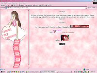
My layout for all of 2004. I wanted to get back to the site's roots of being a Crimson Sky...and somehow ended up with ALL PINK. I don't know how I tolerated it for a whole year. (Yes, I do. I was LAZY.) This was also my first attempt at making an image map. I'm really very proud of that little film strip graphic. |
|
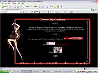
As you can see, this is really just my December 2000 layout, tweaked a bit, and reworked to be all red, white, and black. I chose to redo this layout because, as I mentioned above, the December 2000 layout really was very close to what I had in mind when I originally designed CSC, and I thought it was a shame that it only got used for a month, and I really wanted to see what it would look like in my favorite colors. I also knew, after last year, that I was probably going to have to look at it for an entire year, so I tried to make it something I wouldn't mind seeing 365 days straight. Perhaps I should be ashamed that I reused a layout, but all in all, I really liked the way this looked, and I'm glad I did it. |
|
It wasn't until I saw the RENT movie in November of 2005 that I found inspiration for my 2006 layout. After all, RENT is one of my all time favorite musicals, and I thought it would be really neat if I went with an even more image-laden layout, inspired by the cover of the RENT CD. All of the thumbnails I made can be found in the Past Layout Images section of Storage. Making all the graphics was a lot of work, but it was balanced out by the fact that the HTML was very simple--nothing more fancy then tables. Which is probably why I lost my mind when it came to deciding on a layout for 2007. |
|
The inspiration for my 2007 layout was some of the production art for a PSP game, Every Extend Extra (made by the same people who made Rez for the Playstation.) I talk a little more about the visuals on the "Past Layout Images" page, so let me mention some of the technical aspects here. I designed all of the pages of links to the galleries to be image maps, this was my first time using the new "Table within a table" feature without having to resort to iFrames, and I used CSC to make a single cell of the table scrollable. The transparent scrollbar (though it only worked in Internet Explorer) was a particularly neat touch. |
|
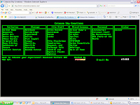
So, I wanted something really hardcore, techno, old school--you know the drill, and what is older-school...er...than DOS? (Answer: probably something that I'm not hardcore enough to know about.) My first computer, a Tandy HX1000, had this program called "Deskmate", and it had little green on black rectangles with little green on black DOS-looking font, so I figured, why not? On the plus side, I didn't have to draw anything new for it. On the down side, instead I had to make a green thumbnail for EVERY SINGLE IMAGE on this site, which by the way did you notice is pretty much an image gallery? And redo the thumbnail for every single one by hand, which took FOREVER. And you know what? Making a new layout for the next year took forever, too, because I had to go back by hand to remove every single one I had put in! But, hey, it was different, so what the hell, right? |
|
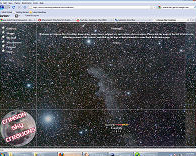
After the entirely plain layout that was 2008, I wanted to get back to my roots of "Crimson Skies"--or, at least, starry skies. I had seen the band Angels and Airwaves play during the summer of 2008, and their stage backdrop was this really inspiring photo of the moon against a starry sky. Doing a Google Image Search for starry skies (I believe; it WAS a year ago, I don't quite remember) I found this photo of the Witch Head Nebula and decided to use it. I used another photo of the moon to make the logo that would link back to the index page. As an interesting note, for the first half of the year, visitors using Firefox on a Mac had trouble loading the site, but either Apple or Mozilla did something to fix this by the second half of the year. |
|
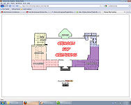
Ever since naming the main section of my site the "Galleries", I've toyed with the idea of doing a museum-esque layout, complete with putting picture frames on all of the thumbnails as if they were hung on display. In retrospect it probably would have looked better if I had learned Flash and somehow had the thumbnails look as if they were hanging on a museum wall rather than used a floorplan, but at least it was easy to navigate! |
|
Since the logo was based on the kind of image and color scheme that is used in a lot of promotional flyers, I tried to keep up that design scheme with the text I used. Much like I did with the 2002 and 2008 layouts, I wanted to have as many sections of the site accessible from the main page as possible. |
|
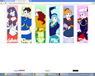
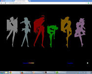
I have no idea what made me think of Patrick Nagel for my 2012 layout. I'm sure I was desperate. It's possible that I had been reading The Sandman, and Desire is (one of) my favorite character(s). (Let's face it, they're all favorite.) And I figured it wouldn't be too hard to draw (HA!). I do like the way the images came out, although they weren't as evocative of Patrick Nagel as I would have liked. All of the full size, textless versions of the images used for the layout buttons are in Storage, and I have my explanations as to why I picked each character written in the alt/title tags there. Due to personal circumstances this layout ended up being used for all of 2013 as well. |
|
I had started this layout in late 2012, but ended up sitting on it until late 2013--which, in a way, worked out, because it was in mid 2013 that it was announced the new Sailor Moon anime would be coming out in 2014. The front page of the site is pretty much the exact same as the 2012-3 layout, but the gallery pages were set up a little differently--more like frame scheme I used in 2005. The thumbnails "light up" and display the name of the page they link to as you mouse over them, a trick I learned in 2008. If nothing else, working on this site for 14 years has been quite the learning experience. |